
TL;DR
National Angels relies on its website to recruit mentors and supporters, but key paths had usability friction that could lead to confusion and drop-off. I conducted a heuristic evaluation of the Love Box Program page and primary navigation using Nielsen’s heuristics, then delivered prioritized recommendations with severity ratings to guide improvements and inform future usability testing.
Context
While supporting National Angels with program materials, I noticed several website patterns that could prevent prospective mentors from quickly understanding the Love Box Program or taking the next step.
Goal
Identify usability issues that could reduce comprehension, trust, and conversion for first-time visitors exploring the Love Box Program.
My Role
Evaluator (expert review). I scoped the evaluation, applied Nielsen’s heuristics, documented issues with annotated evidence, rated severity, and proposed actionable recommendations.
Method
Expert usability inspection using Jakob Nielsen’s 10 heuristics
Evaluated from the perspective of a prospective Love Box mentor
Documented issues as “Opportunity → Recommendation” and assigned High/Medium/Low severity
Key Deliverable
Presentation deck with annotated findings and recommendations
Severity scorecard to prioritize what to fix first (quick wins vs higher-effort changes)
What’s inside the deck
Navigation and wayfinding issues that increase cognitive load
Content clarity and jargon that slow comprehension
Call-to-action visibility and form confirmation feedback
Trust-building opportunities (e.g., social proof)
Recommendation for next steps
Use the severity scorecard to address the highest-impact fixes first, then validate changes with a short usability test with prospective mentors.
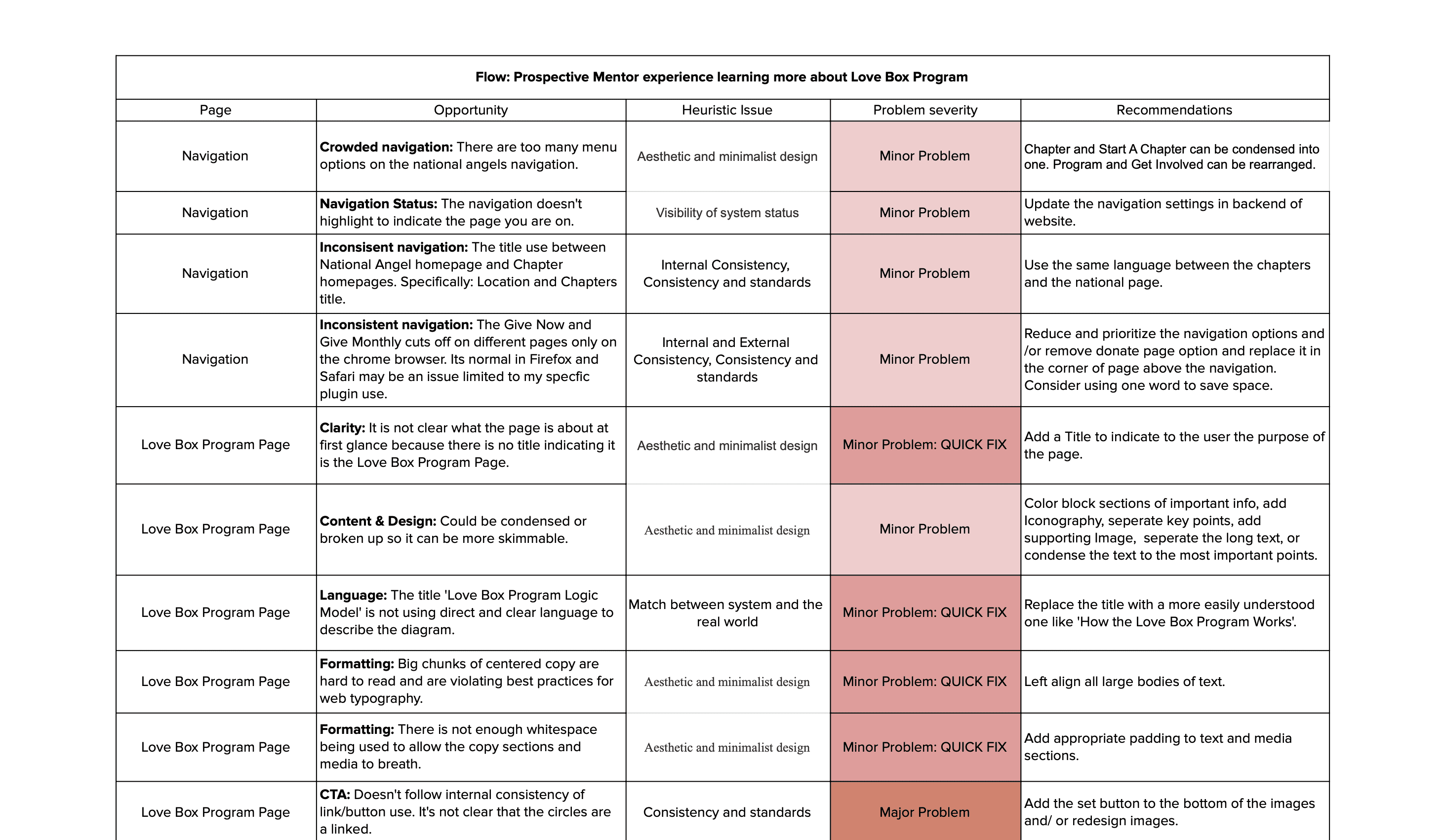
Highlights (Top Issues)
Navigation overload increases cognitive load: Too many menu items make it harder for first-time visitors to find “mentor/program” information quickly.
Unclear page hierarchy reduces orientation: The Love Box Program page doesn’t immediately anchor users with a clear title and scannable structure, slowing comprehension.
Jargon creates avoidable confusion: Terms like “Logic Model” don’t match how prospective mentors think, reducing clarity at key decision moments.
Calls-to-action don’t always look actionable: Some CTAs have weak affordance and inconsistent patterns across pages, which can reduce click-through to the next step.
Trust + conversion gaps: Limited social proof and a low-visibility form confirmation can weaken confidence and create drop-off right when users are ready to commit.
Next Steps
Fix the quick wins first (High severity / Low effort):
Add clear page titling + improve scannability (headings, shorter sections)
Replace jargon with plain-language labels
Strengthen form submission confirmation (prominent success state + “what happens next”)
Address high-impact structural improvements (High severity / Medium effort):
Simplify and regroup navigation to reduce overwhelm
Standardize CTA patterns and ensure they clearly look clickable
Add social proof (mentor testimonials, photos, short story/video modules)
Validate with a short usability test (recommended):
Run a usability test with 5–8 prospective mentors to validate whether fixes improve:time to find key info (commitment/process/next step)
confidence/trust (“Do I understand what I’m signing up for?”)
completion of the “Learn More / Apply” path
Measure impact (if they have analytics):
Track changes in:clicks on primary CTAs
form completion rate
drop-off on the Love Box page
donation path interactions (if applicable)